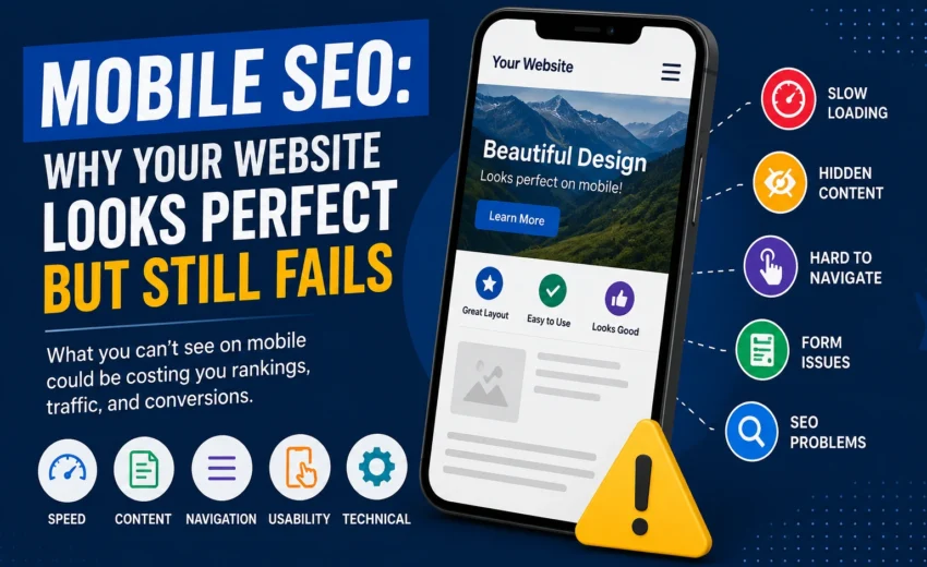
You pull out your phone and open your website. The page fits the screen perfectly. Images load and look sharp. The menu slides open without any glitches.
Everything seems to work.
So you think to yourself, “My website is mobile-friendly. My Mobile SEO must be fine.”
But that assumption could be costing you visitors, leads, and sales.
A website can look beautiful on a smartphone and still struggle with speed issues, content problems, navigation headaches, form failures, or technical barriers that search engines can’t ignore.
Mobile SEO is about more than just having a responsive design. It’s about creating an experience that works for both mobile users and search engines.
What Is Mobile SEO?
Mobile SEO means optimizing your website so it functions properly on mobile devices while allowing search engines to access and understand your content.
This covers several key areas:
- Mobile-friendly design – layouts that adapt to different screens
- Page speed – fast loading on mobile networks
- Content accessibility – important information visible on mobile
- Navigation – menus and links that work on touchscreens
- Images – properly sized and compressed
- Forms and buttons – easy to tap and complete
- Technical SEO – proper crawling, indexing, and rendering
- Mobile-first indexing – Google using your mobile version
- Core Web Vitals – real-world performance measurements
- Overall page experience – how users feel using your site
One concept beginners should understand is mobile-first indexing. Google primarily uses the mobile version of your website for indexing and ranking. Your mobile site shouldn’t be treated as a lesser version of your desktop site.
Why Mobile SEO Matters
Think about how people use their phones. They search for nearby businesses, compare products, read articles, look for services, check directions, make bookings, or fill out contact forms.
They want information quickly without unnecessary effort.
If your website is slow, hard to navigate, difficult to read, or frustrating to use, visitors will leave before completing what they came to do.
Mobile traffic now accounts for over half of all web traffic globally. In some industries, that number climbs even higher.
This is why Mobile SEO affects more than just rankings. It directly impacts the experience people have after they arrive on your website.
10 Mobile SEO Problems You Might Overlook
1. Your Website Looks Good but Loads Slowly
A beautiful design means nothing if visitors are waiting too long for it to appear.
Common causes of slow mobile loading include large images, heavy JavaScript, too many plugins, unnecessary animations, large videos, third-party scripts, and slow hosting.
For a mobile visitor, this creates frustration even if the final design looks excellent.
What you can do:
Start by testing your important pages with tools like PageSpeed Insights or Lighthouse. Then look for ways to compress images, remove unnecessary scripts, improve caching, and optimize server performance.
Don’t get obsessed with achieving a perfect score. Focus on making your website faster and more usable.
2. Your Mobile Version Has Less Important Content
Some websites hide large sections of content on mobile to create a cleaner design.
For example, your desktop version might include detailed service information, FAQs, reviews, internal links, important headings, and complete product details. But your mobile version shows only a small portion.
This creates a serious SEO issue.
Because Google primarily uses the mobile version for indexing, important content needs to be available there too. Google recommends keeping primary content equivalent between desktop and mobile versions.
You can still use mobile-friendly elements like tabs or accordions. The important point is that valuable information shouldn’t disappear from the mobile version entirely.
3. Your Navigation Works but Is Hard to Use
A mobile menu can technically function while still providing a poor experience.
Imagine a visitor wants to contact your business but has to navigate through confusing menus before finding the contact page.
Common problems include crowded navigation, small buttons, links placed too close together, complicated dropdown menus, difficult search boxes, and important pages buried too deeply.
Keep mobile navigation simple. For a business website, important actions might include calling, using WhatsApp, booking, contacting, or getting a quote.
The exact actions depend on your business. The principle is straightforward: don’t make mobile visitors work harder than necessary to find what they need.
4. Your Content Is Difficult to Read
A paragraph that looks normal on a desktop screen can become a large block of text on a phone.
Mobile content needs to be easy to scan. Use clear headings, shorter paragraphs, bullet points where useful, adequate spacing, readable font sizes, and descriptive subheadings.
Don’t shorten every paragraph to one sentence just because you’re writing for mobile. The goal is comfortable reading, not artificially short content.
A visitor should be able to quickly understand what your page is about and find the section they need.
5. Your Images Are Slowing Down the Page
Images are important, but unnecessarily large files can hurt performance.
You might upload a multi-megabyte photograph even though your website displays it at a much smaller size.
Before uploading images, resize them appropriately, compress them, use modern formats where suitable, add useful alt text, and avoid unnecessarily large files.
Image optimization helps both performance and accessibility. But don’t remove useful images simply to make the page faster. Find the right balance between visual quality and performance.
6. Your Buttons and Forms Don’t Work Well on Mobile
Imagine someone finds your service page and decides to contact you. But the form has tiny fields, the keyboard covers the button, or the submit button is difficult to tap.
The visitor may simply give up.
This is particularly important for business websites. Test your important actions yourself. Can someone easily call you? Can they send an enquiry? Can they submit a form? Can they make a booking? Can they complete a purchase?
A page isn’t truly successful just because it loads. It should allow visitors to complete the important action it was designed for.
7. Pop-Ups Are Blocking Main Content
Pop-ups aren’t automatically bad. They can be useful for offers, newsletter subscriptions, cookie consent, login, or promotions.
The problem starts when a pop-up makes the main content difficult to access. This is especially noticeable on a small screen.
If you use pop-ups, make sure visitors can understand them and close them easily. The main content should remain accessible without unnecessary frustration.
Be especially careful with pop-ups that appear immediately when users land on your page. Google has specific guidelines against intrusive interstitials that harm mobile user experience.
8. Technical SEO Problems Hide Behind a Good Design
Mobile SEO isn’t only about what visitors see. A website can look good while still having technical problems.
Check areas like robots.txt, canonical URLs, meta robots directives, redirects, broken links, structured data, JavaScript, CSS, and mobile page content.
For example, if important resources aren’t accessible to search engines, Google may have difficulty understanding or rendering your page correctly.
Understanding the difference between crawling, indexing, and rendering is helpful. Even if Google can crawl your page, rendering issues with JavaScript-heavy sites can prevent Google from seeing the fully rendered content that users see.
You don’t need to become a developer to work with these issues. But you should know what to check and when to involve developer support.
9. Don’t Ignore Core Web Vitals
Core Web Vitals measure aspects of real-world page experience. The current metrics are Largest Contentful Paint for loading performance, Interaction to Next Paint for responsiveness, and Cumulative Layout Shift for visual stability.
These metrics are useful for identifying performance and experience problems.
But don’t make the mistake of thinking that if your Core Web Vitals are perfect, your website will automatically rank higher. Good Core Web Vitals don’t guarantee better rankings. They are one part of a broader page experience, not the entire SEO strategy.
10. Don’t Test Only Your Own Phone
One of the simplest mistakes is opening your website on your own phone once and deciding everything works.
Different devices, browsers, screen sizes, and network conditions can produce different experiences.
Test your important pages including your homepage, service pages, product pages, blog posts, contact page, forms, booking pages, and checkout pages.
You can use browser developer tools to simulate different screen sizes. The homepage working properly doesn’t mean every page is working properly.
A Simple Mobile SEO Check You Can Do
If you’re a beginner, don’t try to check everything at once.
Start by opening your website on your phone and checking the layout, text, images, and navigation. Then test the important actions like calling, submitting a form, booking, or purchasing.
Compare mobile and desktop versions to look for important content that exists on desktop but is missing on mobile. Use PageSpeed Insights to identify performance problems.
Check Google Search Console for any indexing or visibility issues affecting your important pages. And don’t stop at the homepage. Your service pages and conversion pages may have completely different problems.
This simple process can reveal issues that aren’t obvious from a quick visual check.
Common Mobile SEO Mistakes
Some website owners think that because their site fits their phone screen, it’s fine. But responsive design is only one part of Mobile SEO.
Others hide important content on mobile for a cleaner look. This can hurt your SEO because that content may not be indexed.
Focusing only on PageSpeed scores is another common mistake. Use performance scores to identify problems, not as goals by themselves.
Uploading huge images, making buttons difficult to tap, and testing only the homepage are also issues that can hurt your mobile performance.
Treating Mobile SEO as a one-time task is a mistake. Websites change constantly. New plugins, scripts, images, designs, and features can introduce new problems.
Mobile SEO Checklist
Before considering your website properly optimized for mobile, check these areas.
For design, make sure your layout adapts properly, text is readable, and horizontal scrolling isn’t necessary.
For navigation, ensure menus are easy to use, buttons are easy to tap, and visitors can find important pages quickly.
For content, confirm that important information is available on mobile, headings are clear, and paragraphs are easy to read.
For performance, check that images are optimized, unnecessary scripts are removed, and pages load efficiently.
For technical SEO, verify that search engines can access important content, resources are available, and redirects and canonical settings are correct.
For conversions, test that forms work, visitors can easily contact you, and they can complete bookings or purchases.
For testing, make sure you’ve checked different screen sizes and tested your most important pages.
Final Thoughts
Your website can look perfectly fine on your phone and still have Mobile SEO problems.
It might be too slow. Important content might be missing. Navigation might be difficult. Images might be unnecessarily large. Forms might be frustrating. Or technical issues might prevent search engines from properly accessing and understanding your pages.
That’s why Mobile SEO is more than asking whether your website looks good on your phone.
Ask a better question. Can a mobile visitor quickly find, understand, and use what they came for? And can Google properly access and understand the important content?
If the answer is yes, you’re moving beyond simply having a mobile-friendly website. You’re building a website that is better prepared for mobile users, search engines, and modern search.

Alfik P S
hi

August 19, 2026
Your Old Blog Posts Are Losing Traffic: Here’s...

August 19, 2026