More people browse the internet on smartphones than on desktop computers. Whether someone is searching for a local business, reading a blog post, comparing products, or making an online purchase, there is a good chance they are doing it from a mobile device.
Now imagine a potential customer finding your website through Google. They tap your link, but the page loads slowly. The text is difficult to read, buttons are too small to tap, and images shift around unexpectedly. Frustrated, they leave and visit a competitor instead.
This is why mobile optimization matters.
A poor mobile experience does not just affect user satisfaction—it can impact search rankings, reduce conversions, and cost your business valuable leads and sales. Since Google primarily uses the mobile version of websites for crawling and indexing, mobile optimization has become a critical part of modern SEO.
In this guide, you’ll learn what mobile optimization is, why it matters, and the practical steps you can take to improve your website’s performance, usability, and visibility in search results.
What Is Mobile Optimization?
Mobile optimization is the process of designing and improving a website so it performs effectively on smartphones and tablets.
A mobile-optimized website should:
- Load quickly
- Adapt to different screen sizes
- Display readable text
- Provide touch-friendly navigation
- Deliver a smooth user experience
Mobile optimization is much more than shrinking a desktop website to fit a smaller screen. It involves creating an experience specifically designed for how mobile users browse, search, and interact online.
Mobile users often have less patience, rely on touchscreens instead of a mouse, and expect information to be available immediately. Your website should be designed with these behaviors in mind.
Why Mobile Optimization Matters
Mobile optimization affects far more than appearance. It influences SEO performance, user engagement, and conversions.
Benefits of Mobile Optimization:
- Better search engine rankings
- Improved user experience
- Lower bounce rates
- Higher engagement
- Increased conversion rates
- More leads and sales
As mobile usage continues to grow, websites that provide a seamless mobile experience gain a significant competitive advantage.
Understanding Mobile-First Indexing
Google introduced mobile-first indexing to reflect how people use the web today.
Instead of evaluating the desktop version of a website first, Google primarily uses the mobile version for:
- Crawling
- Indexing
- Ranking
This means your mobile website should contain the same essential content, metadata, internal links, and structured data as your desktop version.
Common Mobile-First Indexing Issues:
- Missing content on mobile pages
- Hidden navigation elements
- Missing structured data
- Slow page speed
- Mobile usability errors
Google Search Console can help identify many of these issues before they impact rankings.
Responsive Design: The Foundation of Mobile SEO
Responsive design allows a website to automatically adapt to different screen sizes while maintaining the same URL and content.
Popular platforms that support responsive design include:
- WordPress
- Shopify
- Webflow
- Wix
- Elementor
Benefits of Responsive Design:
- Easier website management
- Consistent user experience
- Better SEO performance
- Reduced maintenance costs
However, responsive design alone does not guarantee a great mobile experience. During website audits, it is common to find responsive websites that still suffer from slow loading speeds, oversized images, and usability problems.
Responsive design is the starting point—not the finish line.
Mobile Page Speed Optimization
Page speed is one of the most important aspects of mobile optimization.
Mobile users expect websites to load quickly, and even small delays can increase bounce rates and reduce conversions.
Why Speed Matters
A visitor searching for an emergency service, hotel room, or product is unlikely to wait for a slow website to load.
Faster websites typically provide:
- Better user experience
- Higher engagement
- Lower bounce rates
- Improved conversion rates
How to Improve Mobile Page Speed:
- Compress images
- Use WebP or AVIF image formats
- Enable browser caching
- Reduce unnecessary JavaScript
- Minify CSS and JavaScript files
- Use a Content Delivery Network (CDN)
- Choose reliable hosting
Tools like Google PageSpeed Insights and Lighthouse can identify opportunities for improvement.
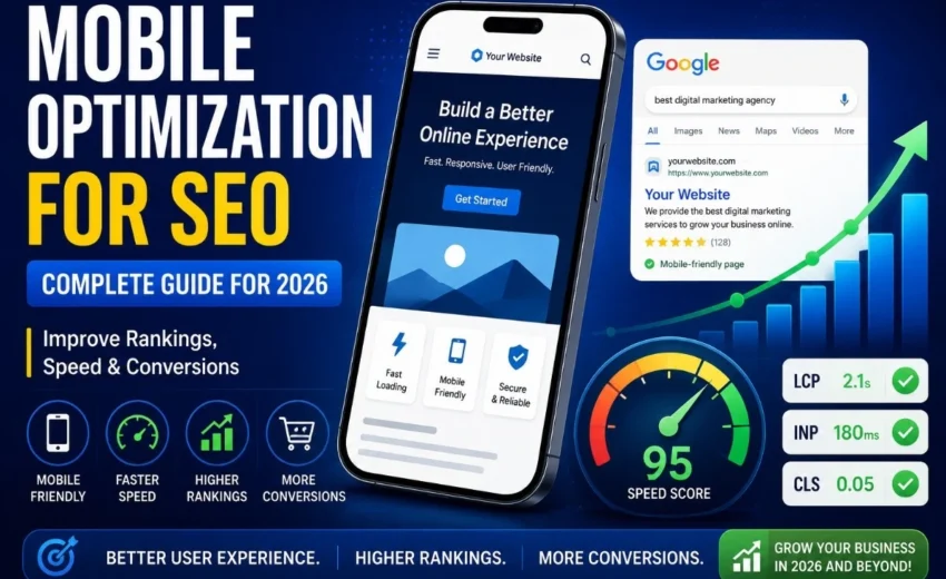
Core Web Vitals Explained
Google uses Core Web Vitals to measure real-world user experience.
Largest Contentful Paint (LCP)
Measures how quickly the main content becomes visible.
Recommended Target: Under 2.5 seconds
Interaction to Next Paint (INP)
Measures how responsive a page is when users interact with it.
Recommended Target: Under 200 milliseconds
Cumulative Layout Shift (CLS)
Measures visual stability and unexpected movement on the page.
Recommended Target: Below 0.1
Tools for Measuring Core Web Vitals:
- Google Search Console
- PageSpeed Insights
- Lighthouse
- GTmetrix
- Chrome UX Report
Improving Core Web Vitals often improves both user experience and SEO performance.
Mobile Navigation Best Practices
Mobile users interact with websites using touchscreens, making navigation especially important.
Best Practices:
- Use large tap targets
- Keep menus simple
- Make phone numbers clickable
- Create easy-to-complete forms
- Maintain a logical site structure
One common issue found during mobile audits is overly complicated navigation. Simplifying menus often improves both engagement and conversions.
Content Readability on Mobile
Mobile users typically scan content rather than reading every word.
Improve Readability By:
- Using short paragraphs
- Adding clear headings
- Including bullet points
- Increasing font size where necessary
- Using adequate white space
Well-structured content is easier to consume and keeps visitors engaged for longer periods.
Mobile Optimization and Conversions
Mobile optimization directly impacts business performance.
Whether a visitor wants to:
- Purchase a product
- Submit a contact form
- Book a consultation
- Request a quote
A poor mobile experience creates friction that can reduce conversions.
Ways to Improve Mobile Conversions:
- Simplify forms
- Reduce required fields
- Add click-to-call buttons
- Support Apple Pay and Google Pay
- Display trust signals and reviews
- Use clear calls to action
Even small usability improvements can significantly impact conversion rates.
Common Mobile SEO Mistakes
Many websites continue to make avoidable mobile optimization mistakes.
Slow Loading Pages
Large images and excessive scripts slow down performance.
Tiny Fonts
Users should never need to zoom in to read content.
Difficult Navigation
Complex menus make information harder to find.
Intrusive Pop-Ups
Large pop-ups can frustrate users and hurt usability.
Unoptimized Images
Oversized images increase loading times.
Skipping Mobile Testing
A website that works on one device may not work properly on another.
Tools to Test Mobile Optimization
Several tools can help identify mobile usability and performance issues.
Google Search Console
Monitor mobile usability and Core Web Vitals.
Google PageSpeed Insights
Analyze speed and performance recommendations.
Lighthouse
Audit performance, accessibility, and SEO.
Identify page speed bottlenecks.
BrowserStack
Test websites across real devices and browsers.
Regular testing helps maintain a strong mobile experience over time.
Mobile Optimization Checklist
Before launching or updating a website, ask:
Technical Checklist
- Responsive design enabled
- Proper viewport configuration
- Structured data implemented
- Mobile-friendly URLs
Performance Checklist
- Fast loading speed
- Optimized images
- Browser caching enabled
- Core Web Vitals passing
User Experience Checklist
- Readable text
- Touch-friendly buttons
- Simple navigation
- Mobile-friendly forms
Testing Checklist
- Tested on multiple devices
- Tested on multiple browsers
- Checked with PageSpeed Insights
- Reviewed in Google Search Console
The Future of Mobile Optimization
Mobile optimization continues to evolve as technology advances.
Key trends include:
- Artificial intelligence (AI)
- Voice search
- Progressive Web Apps (PWAs)
- Personalized mobile experiences
- 5G technology
- Augmented reality (AR)
Businesses that adapt to these trends will be better positioned to compete in search results and deliver exceptional user experiences.
Final Thoughts
Mobile optimization is no longer optional. It is a critical part of SEO, user experience, and conversion optimization.
A fast, responsive, and easy-to-use mobile website helps search engines understand your content while making it easier for visitors to engage with your business.
The websites that perform best in search results are often the ones that provide the best mobile experience.
The question is no longer whether your website should be mobile-friendly—it’s whether your competitors are already delivering a better mobile experience than you are.

June 19, 2026